“DateMate” App

About the Project
DateMate is a responsive web app for people to access anonymous advice and coaching relating to dating and relationships.
The Story
This project was completed as part of my “UX Immersion” course at Careerfoundry.
For this project, after being given a choice of initial brief (in my case I chose the “Ask an Expert” style app), the details of this app were broadly left up to me to do what I wanted. The goal here was to see a project through from initial concept to polished prototype.
There were several different skills I got a chance to try my hand at here so I’ve gone ahead and picked out the most important deliverables and processes below.
UNDERSTANDING THE PROBLEM
My inspiration for this project came from several sources, but the initial spark came from a conversation with a close friend who wanted me to check out his dating profile. He hadn’t had much luck getting matches and wanted me to review the profile from a woman’s perspective. Having not been in the online dating scene for a while, I had no idea what advice to give him and we ended up taking a “best guess” at what people would want to see. That ultimately led me to the concept of the DateMate app.
The Problem Statement
Our single professionals looking to date need a way to access expert, individual advice on dating and relationships in a confidential, friendly and discreet way because they may be too embarrassed or unable to ask friends and family.
We will know this to be true when we see users accessing advice and tips through our app that improve their love life.
Competitive Analysis
To start this journey I took a look at other apps already looking to solve this need.
Immediately it became apparent that there were very few competitors in this field so I had to expand the search to applications looking to provide broad advice on relationships and dating.
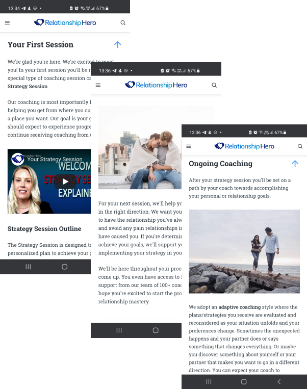
To read my full competitive analysis report, click here.
From this research, I generated user stories to guide my project further.
User Stories
“As a user, I want to be able to browse through the available experts with easily accessible information about them, so that I can make an informed decision on which one I want to talk to.”
“As a user, I want to be able to access information on topics that are relevant to me so that I can learn more about dating and relationships.”
“As a user, I want to be able to quickly and easily book and pay for the expert sessions I want, so that I can concentrate on the advice I’m being given.“
USER RESEARCH
User Research
To further explore the problem space, I conducted interviews with 3 users from the target demographic. I then created affinity maps to organise the data and extrapolate insights.
Research Goals
- To understand how users currently access information and advice regarding dating and relationships.
- To gather information on the features users think would be valuable to them in their lovelife.
- To understand users’ hesitations or when they would feel uncomfortable discussing embarrassing topics.
- To determine what kind of expert advice the users would like to receive in regards to dating and relationships.


Research Insights
- Verification, reassurance and trust are common themes so we should align our design strategy to provide these to our users.
- Ultimately, what users are looking for is CONFIDENCE (“My profile is a good one and likely to attract relevant and genuine matches”; “I have accurate information on sex and sexual health”; “I have been given dating advice and tips from an expert who has relevant experience or qualifications”.
- Users are more like to reach out for advice from a “friend” figure, however this contrasts with the need for advice from an authoritative figure. Our challenge will therefore be to construct the concept of an “Authoritative Friend”.
User Personas


From the data gathered from the user interviews, I created two key user personas to drive the design decisions. These were key in reminding me of the role of the user in the design process, and as the profile that most clearly represented my target demographic I often found myself saying:
WWMD: What Would Matt Do?
From there I was also able to generate task analysis from the key app functions and user flows. These ended up being a big part of determining my information hierarchy within the app and ultimately created the general flow of the entire app experience.
Task Analysis and User Flows


I created task analysis and user flows for the 3 key features of my app by leveraging the perspective of my user personas. The user flows were especially important in determining the screens required and the general outline of the sitemap. I tried to keep the number of steps to complete each task to a minimum while also trying to delineate each task flow sufficiently so that users were not confused about the flow they were in. This was ultimately much improved by my card sorting exercise later in the project.
IDEATION
Sitemap
Once I had a clear understanding of the problems I was trying to solve and some information about how the user might solve these problems from the user journeys and user flows, it was time to start piecing together a sitemap.
After creating a rough draft of a sitemap, I performed a card sorting using the same users I interviewed previously. The card sort results were then used to refine the sitemap.


The card sort was pretty clear in the 3 key areas of the app that needed to be fleshed out. I used this information to then make decisions about the app navigation. Specifically, I decided that the 3 areas indicated by the card sort should be given a tab in the bottom bar navigation as these are going to be the most used areas of the app. Other, less used, functions could be accessed through a hamburger menu.
WIREFRAMING & PROTOTYPING
I spent a long time looking at other apps and how they implemented their functionality before evaluating which would be the best approach for my app. For example, the Knowledge section on my desktop wireframes was influenced by the design of Medium.com.
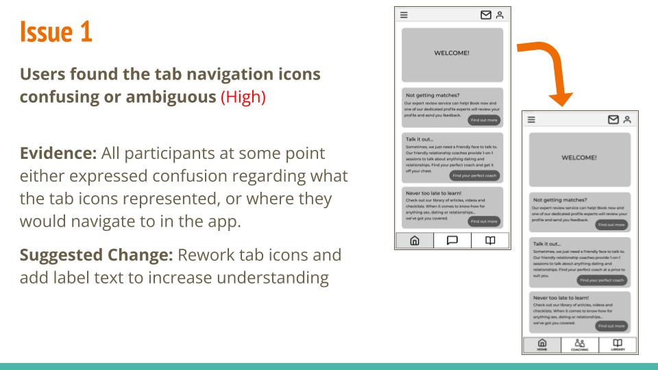
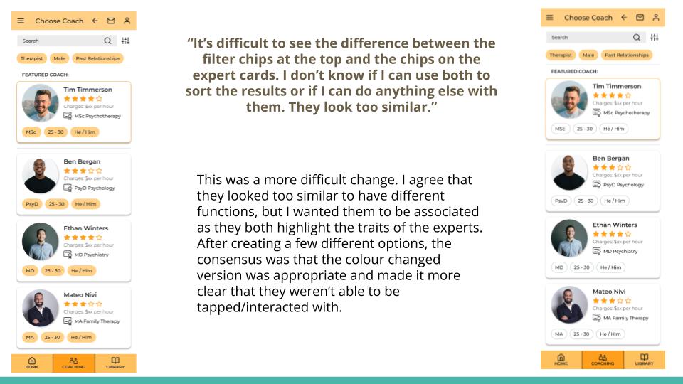
I sketched low-fidelity wireframes by hand initially, before converting them to digital copies. Once I had a clearer idea of the design I was going for, I created medium-fidelity wireframes that I then merged into an initial prototype. After usability testing this prototype, I then incrementally iterated the design to incorporate user feedback, follow Material Design principles, follow accessibility guidelines and also reflect peer feedback.


I really enjoyed the paper prototyping as it gave me a quick, hands-on way to explore the problem and ideate solutions. However, I found that I initially struggled to then convert the paper prototypes into digital copies for sharing and prototyping. In the future, I’d be interested to explore using digital sketching tools to create initial wireframes that, while still low-fidelity, are also easily shared/manipulated digitally.
The process was a long one but I learned a lot throughout.
TESTING & ITERATION
I conducted usability testing on the prototype of Datemate using 6 participants from my personal network. Tests were conducted virtually, and after an initial briefing, participants were asked to perform specific tasks using the prototype.
Participants reported a high level of satisfaction using the prototype and concluded it was very easy to use. Several feedback points were repeated by different participants, giving confidence that a small number of usability improvements would have a greater effect on overall usability.
For more details, see my completed test report here.
Improving the Design
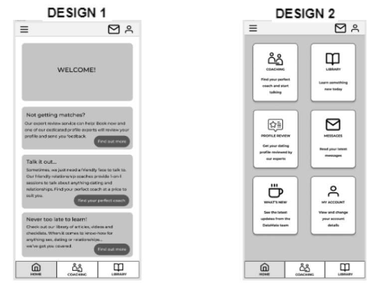
I also conducted a simple A/B preference test on potential homepage designs. While users clearly preferred one design over another, it was actually the additional comments they made during testing that I found most useful in driving the design forward.
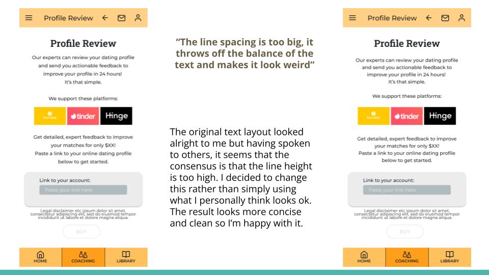
Once I felt the design was at the “polishing” stage, I shared it with my peers to gather feedback from other designers. The feedback I got was extremely valuable for small changes that really pulled the design together. I wish I had shared the design with others at earlier stages as well.
CONCLUSIONS
Project Conclusions
I learned a lot throughout the course of this project. For the most part, I was completing tasks I had never attempted before and I would do a lot of things differently next time.
I think my biggest takeaway here would be the cyclical nature of the design process. Initially, I was frustrated at having to return to previously made decisions and re-evaluate them based on new information, but I quickly learned that this was all part of the process.
I’m proud that I stuck to my goal of not getting too “lost in the weeds”. I have previously struggled with insisting that every stage of a project be ‘perfect’ before moving on, but here I was able to go with the flow a little more and not worry so much about the details in the early stages of the project. I think ultimately it improved the design decisions I made because I wasn’t afraid of losing work I’d spent a lot of time on.
Next Step: continue designing additional features (onboarding, profile details section, expert messaging system) to create a complete MVP design.
