“Learn2gether” App
About the Project
This project was completed as part of my “Intro to UX” course at Careerfoundry.
The course covered the basic processes in UX and in order to learn in a hands-on way, we went through these while focusing on a project. Therefore, I didn’t have much choice about the project content, being given a pretty specific brief (no bad thing) but also having some restrictions on the basis that this was a graded assignment.
As this was an intro course, we also didn’t go deep into the details. The goal was more to get a taste of the processes involved.
Still, this was a great way to learn some of the core principles involved and start to get to grips with some of the tooling.
No time? Check out this short project presentation and retrospective

The Brief
Problem: How might we design a mobile app that empowers people to learn new vocabulary?
Who: Target audience of choice (I chose professionals aged 25-35)
What: A mobile application focused on learning new vocabulary
Details: This application is meant to be used on-the-go for quick 5 to 10-minute study sessions. It needs to be designed for a specific circumstance, user should be able to personalize the experience and it should be accessible for visual learners.
FEATURE REQUIREMENTS
-
- A splash screen
- Onboarding process
- Sign up / log in
- Admin area
- Navigation menu
- Ability to upload custom vocab words and definitions
- A way of reviewing vocabulary
The Story
Competitor Research
To start this journey I took a look at other apps already looking to solve this need.
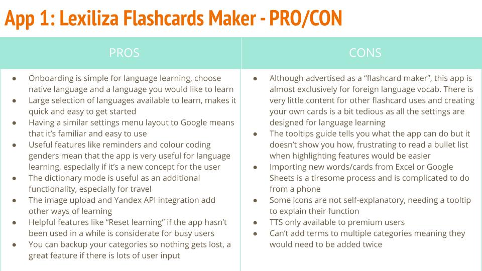
Immediately it became apparent that the majority of solutions were either focused specifically on language learning or aimed at school children. Of the few apps that seem designed for similar purposes for the one outlined in the brief, there was a big variance in quality and features.
Had this been a commercial project I think at this point I’d be having a serious sit-down with the team as to why exactly we were looking to make this app.
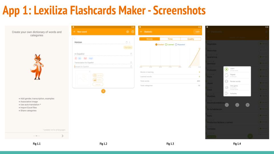
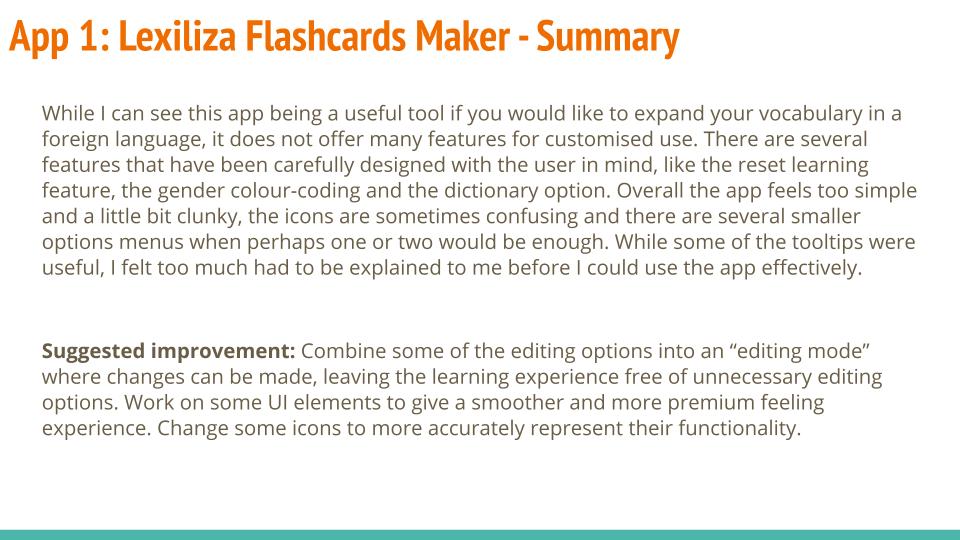
This being a conceptual exercise, I carried on and reviewed 3 apps with a break down of pros/cons, my initial impressions and some suggested improvements.
I also created a breakdown of features that were common to existing apps to give me an idea of what users would be expecting. It also gave me some ideas as to what the USP of the app could be by highlighting the current gaps in the market.
Findings: There doesn’t seem to be much demand for apps in this problem space. Those that do exist are mostly focused on language learning and school curriculums.
Decisions: Users will probably be expecting to see progress and statistics from their learning so we should probably include those too. Similarly, a matching game would appear to be expected.
Next steps: While I have an idea now of what already exists on the market, I need to figure out what a user base not specifically looking to learn a language or school children would be looking for in an vocab app. I need to figure out their pain points and expectations.
NOTE: At this point I would be questioning what had led me to the point of deciding that this app was something worth continuing. As this was a learning exercise however I continued with the process. I also had some restrictions on my available subject pool for user research and usability testing. As such, I decided to use a target audience of 25-35 year olds to better match my available 'users'. However in a commercial setting I think this need would be more likely to apply to school children.
User Research
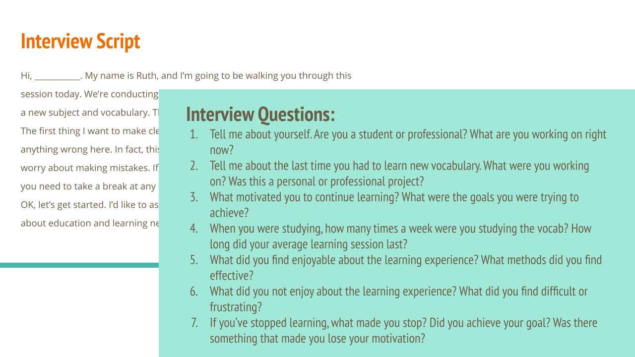
While I think initially a survey of my target audience would be more appropriate for this early stage, due to time/funding/scope restrictions I went ahead with the user interviews.
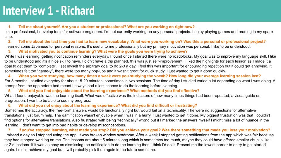
My goal was to explore the problem space by identifying the key pain points my users had experienced in the past while using vocab learning apps. I specifically narrowed my focus here, choosing to explore what made users stop using a system as I thought that user retention would be the biggest business challenge here if this was a commercial setting.
As this was the first time I’d done a true user interview I made a lot of mistakes in terms of leading questions and letting my own assumptions guide the questioning. I learned a lot of important points regarding the practical aspects of conducting an interview that I will definitely be applying these lessons next time. It was certainly a lot more challenging than I thought it would be.
Findings: Motivation to continue learning is definitely a pain point, although it was interesting that most users reported wanting to continue at a future date. Too much gamification put these users off. Notifications, similarly, seemed to be an annoyance to most users. Being failed on a technicality was also mentioned as a problem.
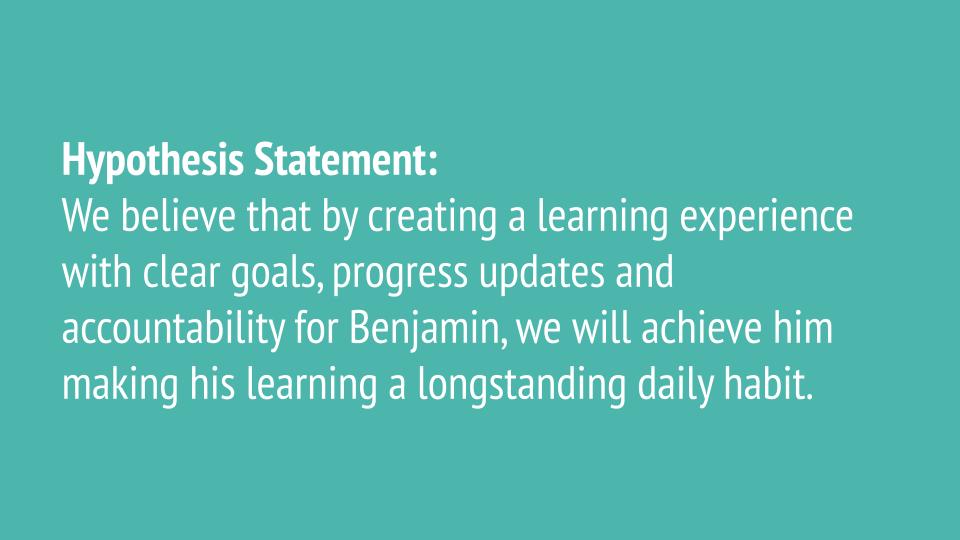
Hypotheses:
- Explore creating a low barrier to re-entry to improve motivation, a possible solution to broken-window syndrome.
- Keep the app simple and goal focused, less reliance on gamification tactics to keep learners engaged.
- Allowing users to dictate the notifications they’ll receive will give them agency and make them less annoying
- Self-marking means users wont be failed for something like a spelling mistake, that might remove some frustrations
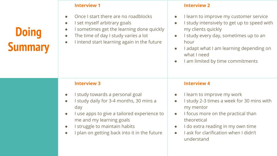
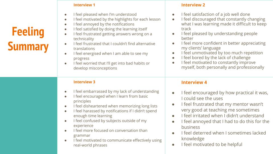
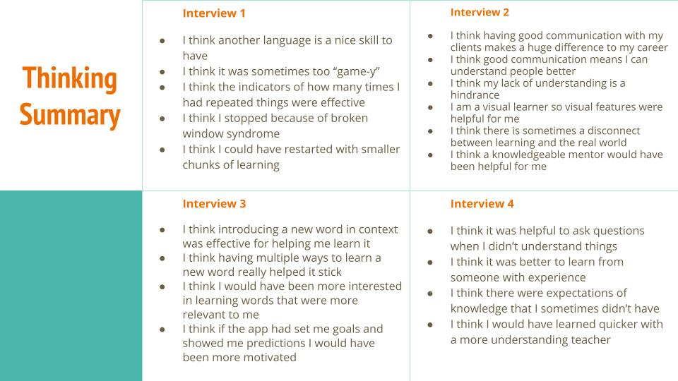
Next steps: Draw from the combined think/feel/do statements pulled from the interviews to create a proto-persona.
User Persona
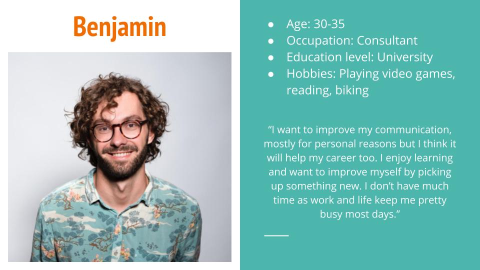
So I really enjoyed this aspect of the project. I liked the challenge of combining my interviews and target audience ideas into a living (in my head) person. I think I did well at it too.
While this is only a proto-persona, I can absolutely see how fleshing out all the little aspects of a fictional user would help better understand their motivations. I certainly went further than I needed to for the assignment in order to make “Benjamin” real to me, almost as if I could ask him questions directly and he could reply. I wish I’d had a bit more time to maybe create a second proto-persona.
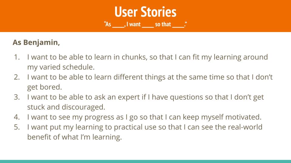
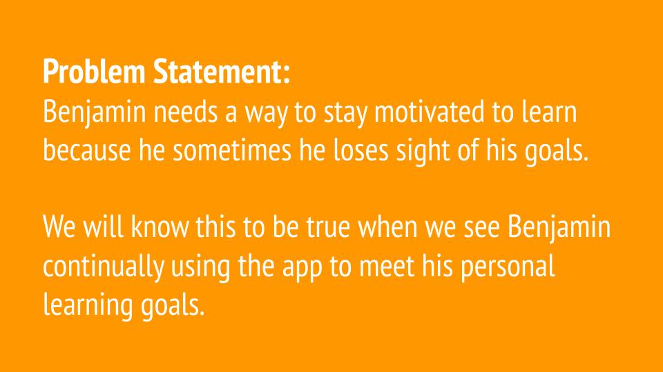
Learning to create user stories and problem statements was not a million miles away from some of the Psychology studies I created in university but I think I probably need more practice at them to get the nuances down.
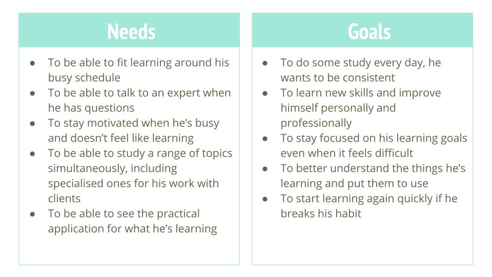
Findings: By combining the information presented by the user interviews, I have created a proto-persona “Benjamin” that encompasses the amalgamate, which has helped define the needs and goals I need to focus on going forward.
Decisions:
- Needs can be broadly summarized as: flexible, informatory, motivational and applicable. I need to keep these in mind going forwards.
- To include features and options to cover the 5 goals Benjamin has:
- To study every day – some kind of “start where to left-off” or quick jump in option for when he’s busy
- To learn new skills – a wide variety of topics so Benjamin can pick and choose
- To stay focused on his learning goals – a tracker and usage statistics so Benjamin can keep motivated by seeing how far he’s come since he started
- To better understand the things he’s learning – option to talk to an “expert” on the subject and ask them questions directly
- To start learning again if he breaks the habit – set the lowest barrier to re-entry, like having a reminder notification suggesting to answer just one question or similar
Next steps: To work out how Benjamin will access these features and how the app’s basic functions will work.
NOTE: I already have far more features in mind than the scope of this project allows for. I returned to the project brief to choose the features that would cover the points presented there. From that I decided what my effective MVP would be and continued on. However, I already had lots of ideas for what could be added at a later date.
Task Analysis and User Flows
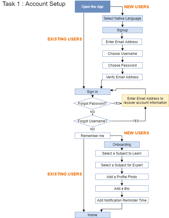
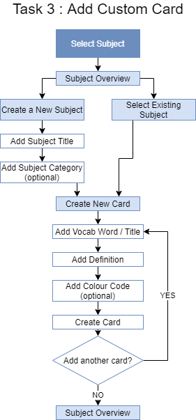
Having decided on the 3 key areas I could focus on for a ‘MVP’ for this project, I created a task analysis and user flow for each of them.
It gave me the opportunity to think about not only the flow and options to present the user but also a chance to start to think about how the information would be presented, how many screens I would need for each process and generally get an initial mental image for what the app could look like.
I found I was able to rely on my own internal schemata to help guide the way for common tasks like setting up a new user profile. Looking back, I think that this is where having a broad knowledge of the differences between HIC and Material Design would have started being really useful as it caused me some problems later on.
Findings: By taking the time to map out the user flows I now have a much clearer idea of what I need to create and how it will work internally.
Decisions:
- Many small initial decisions regarding options available to the user at a given point and similar.
- I also had to come up with some ideas about how much information should realistically be displayed on any given screen, where to break up the information and segment it or where it would be more usefully combined into one screen with many options (like “create a new card”).
- Subtler decisions like the fact that although my user flows end after a certain action, I need to be aware of the next likely action the user would take, in order to drop the user back in at the most convenient point.
Next steps: To create a low fidelity prototype using the user flows as a roadmap.
Wireframing and Prototyping
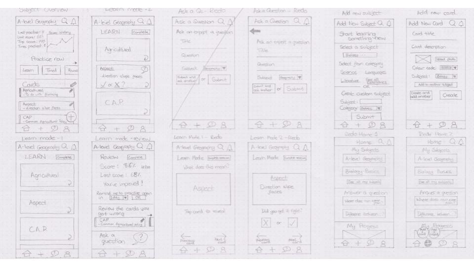
So, now having a clearer idea of what I would need, I set about creating some wireframes.
The course required that we create these wireframes on paper and I think in retrospect this was a great learning opportunity. However, it was pretty frustrating that I couldn’t immediately change anything I was unhappy with.
After a few tries I got a series of wireframes I was happy with and moved on to prototyping. Using Marvel I was easily able to pull these together into a simple, low-fidelity prototype. One thing I hadn’t considered before this stage was the transition animations and how they would affect user flow, it’s certainly something that I intend to research a little more for next time but for now I went with a simple left/right slide animation to indicate if the user was going up or down in the information hierarchy.
I definitely need to improve my UI skills here but I learned a lot about the art that is wireframing and prototyping. As soon as I put the prototype together I realized I needed to make some changes to the wireframes so in the future I think I’ll be less concerned about making the wireframes ‘perfect’ before adding them to the prototype, that way I won’t waste too much time if I need to re-do them.
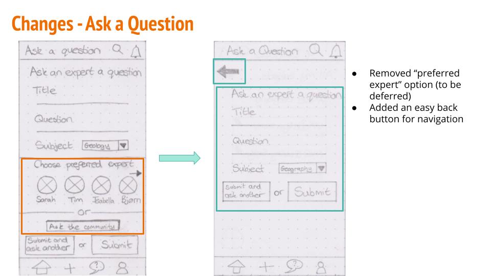
NOTE: Here is where I actually had a really important learning moment. Having never used an iPhone in my life, I hadn't realized that iOS systems don't have a "back" button. Yes there are gestures, but I think I should have included more navigation options in my wireframes to accommodate this from the beginning. Just goes to show that "you don't know what you don't know", I wont be making that mistake again at least.
Findings: Once I got my wireframes into a usable prototype I immediately realized that some of them needed changing to make the flow more natural.
Decisions:
- A key decision early on was that I wanted to avoid, where possible, having pop-up tooltips to guide the user through the app. I felt that I should be able to design the layouts in such a way that navigation was intuitive enough that the user wouldn’t need any additional guidance. This definitely challenged me to come up with clean layouts and focus on the user needs and common workflows.
- It was actually at this stage that I came up with the navigational layout and options for the app. I think I made these decisions way too late in the design process and it was actually something I should have been thinking about way before this point. Next time I’ll be thinking about navigation a lot sooner.
Next steps: Usability testing to see if my design ideas actually hold up in front of real users.
Usability Testing
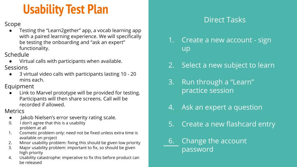
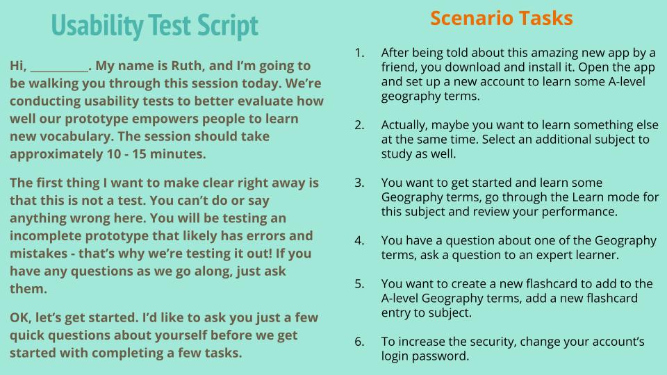
Here is where the real fun begins. The process of creating a test plan, direct tasks test script and scenario tasks was a fun challenge. I think I was helped here by the briefing being quite specific about what I needed to include, I used the requirements as a basis for my direct tasks to make sure that the essentials were covered. I then fleshed them out into scenario tasks using the task flows I had made to give the test subjects logical progression through the app.
I was really, really glad I had read “Don’t Make Me Think” by Steve Krug at this point. There is a lot to learn about the practicality of running these sessions and I think the only way to learn is to get hands-on and make mistakes. Still, the advice he offered in the book was exceedingly helpful and I think I did ok for a first attempt here.
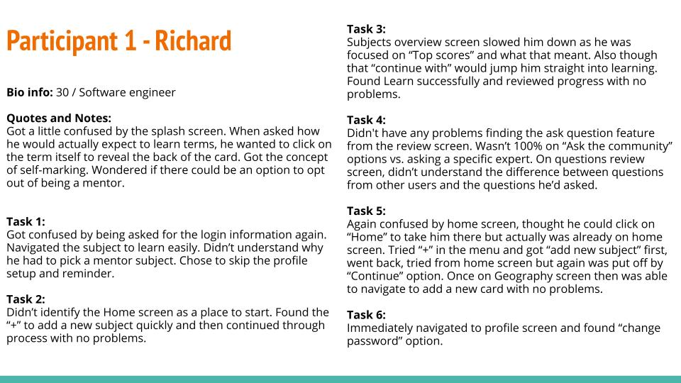
I need to improve my test management for sure but I now have a much better idea of where I need to improve. Key point for next time: let the silence sit, the user will ask if they have questions otherwise just let them think.
Immediately some pretty big flaws appeared in my prototype design but I was actually pretty excited about that. I wanted to go back and change things immediately but I completed my interviews, created a test report and then identified what needed changing most urgently. I did this using Jakob Neilsen’s error severity rating scale:
0. I don’t agree that this is a usability problem at all
1. Cosmetic problem only: need not be fixed unless extra time is available on project
2. Minor usability problem: fixing this should be given low priority
3. Major usability problem: important to fix, so should be given high priority
4. Usability catastrophe: imperative to fix this before product can be released
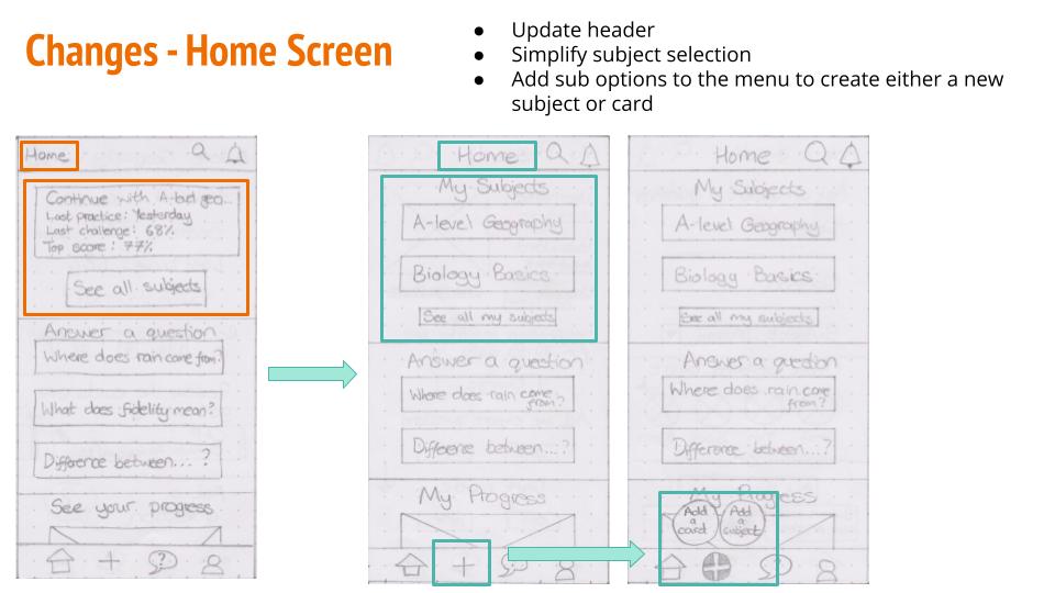
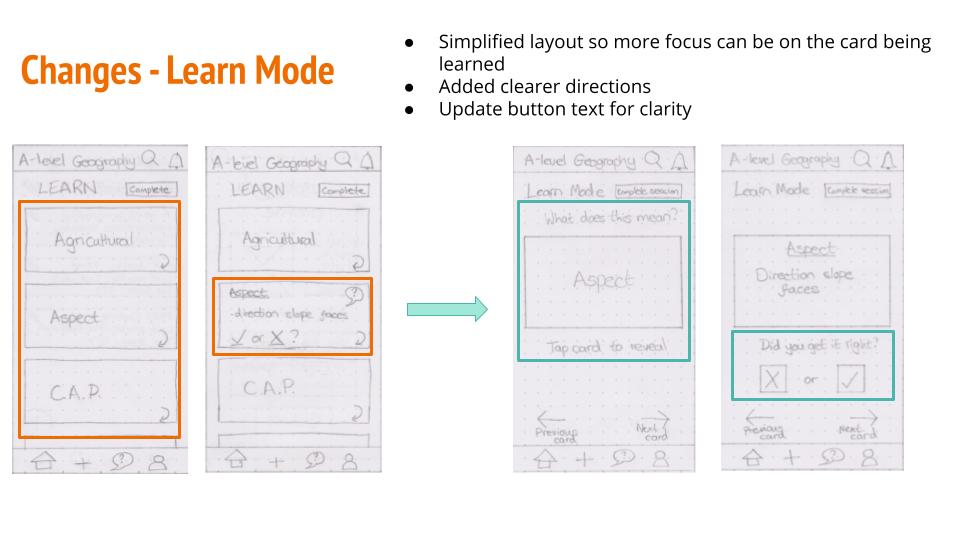
I was able to make some pretty big improvements from my test results. I’ve included a selection of before/after screens here to showcase some of the adjustments I made. I wish I had more time to go back and re-do the usability testing to confirm these changes had improved the UX but unfortunately given the time constraints this wasn’t possible.
Presenting My Work
Once I completed the changes I wanted from the usability test report, I moved on to the final stage of this project which was presenting my work. I created a presentation to showcase the story if the project’s development, along with a retrospective review of where I went wrong and what I could improve next time.
I have identified a number of areas where I need to improve but I have highlighted a lot of lessons I learned along the way above. Given the small scope of the project I didn’t have much room to stretch my creative legs as such, but this was definitely an excellent introduction to some of the standard UX toolkit and processes.
